
Sunday 2 December 2012
Thursday 29 November 2012
Poster Design
RESEARCH:
At last, I'm working out with my product's poster. Designing a poster, you need to be very attractive and catches people's attention. Message must be deliver clearly with pictures or words.
Like the previous assignments, I did research on the Internet as well. And found out that, yogurt product's posters are usually designed in bright colour background, for examples like white the most, follow by, light blue, orange, yellow, pink and light green.


This poster gives me a different kind of feeling. It makes me think of the Retro Design we did in class tutorial. So, I'm thinking to use this as guideline, to design my own poster with combination of retro design. =)

CRAFTING:
Step 1: Open up all the files I designed (Logo, Cup and Retro Design)
Step 2: Download a cup template and draw the outline


Step 3: Combine with Cup Design


Step 4: Change cup design colour, I planned to design 3 different colours cups, and put them in the poster design.


Step 5: Sketch yogurt ice-cream.

Step 6: Combined it with cups.

Step 7: Add in Retro Design. Black colour background so that the retro design's colours become sharper and easily to grab attention.

Step 8: Re-set colour for brand name.

Step 9: Combination of everything. <3 [Finally!]

FINAL ARTWORK

Monday 26 November 2012

Sunday 4 November 2012

Thursday 1 November 2012
'FroYo Style' Cup Design
Before designing the cup, I came up with a concept - simple and nice.
Doing research on Internet, I saw complicated design and simple design as well. And, simple design somewhat attracted my attention.
This is my idea came from, logo in the middle of the cup, then different colours as background. Besides, people usually have different interest, they can pick on their favourite colours.


Well, the picture below attracted me as well. The design is very creative and colourful.

CRAFTING:
I would like to put my logo on the cup as the first thing to see when you look at the cup. But first, I have to colour the background.

Add in my logo.

Next, to make it feel like 'Frozen' and I plan to add in some snowflakes.

Used spray tool to spray those snowflakes.

Make arrangement for the final design:

Trying on different colours.


When I was trying to fit in my design into template that lecturer uploaded earlier, I found that my design couldn't fit in. Then I have to draw another 'cup', which similar to template's cup, then only I arrange the design again.

Final Design:


Sunday 21 October 2012
Character Design
ROCKY

I designed a dog is because my dog is just like my mascot. He brings happiness to my family and neighbours. I'm glad to have a dog like 'Rocky'.


Character name comes from my dog's name -Rocky.
I designed a dog is because my dog is just like my mascot. He brings happiness to my family and neighbours. I'm glad to have a dog like 'Rocky'.
With template:

=)
Monday 15 October 2012

Tuesday 9 October 2012
'FroYo Style' Logo Design
RESEARCH
There are few frozen yogurt companies in Malaysia. For examples like our biggest competitor - Tutti Frutti, Moo Cow, NESTLE, Marigold and many more. There are also some fruit juice companies producing yogurt drinks as well.
I had found some logo design from the internet, and yet comparing them on how they design a nice logo to attract customers' attention.

Tutti -Frutti & Moo Cow.
Tutti - Frutti is actually using very 'sweet' colour and fruits on designing their logo. While Moo Cow, in my own opinion, it's logo has a concept which is 'simple and nice'. They choose cow as their logo design is because everyone knows yogurt made from cow's milk. When people look on it at first sight, will automatically think of yogurt.

This logo design found from a designer web page. I'm kind of attracted to this logo because I love the colour the designer used in the logo. It is girlish and looks so gentle.
MYO & Yogurt Cafe
The upper one is a logo of a yogurt shop, which located in Monterey, CA.
The upper one is a logo of a yogurt shop, which located in Monterey, CA.
Yogurt Cafe (bottom) also found from a designer webpage.
CONCEPT & IDEATION
Before I have any idea on creating my own logo, I did a lots of research on logo instead of just yogurt logo. And people usually love to use rounded shapes in the design. For examples like Starbucks, Mercedes - Benz, BMW, Pepsi, Dell and many more.

This is where my inspiration/ideation came from.
I would like to create a mascot for my brand and also will appear on the logo. Penguin origin from southern part, which is the coolest place of the earth. And they are cute and tame (if people don't attack or disturb them, I think they will be so nice.) so that I use 'penguin' as my logo's mascot.
Besides, instead of using round shape, I come out with an idea which is using STAR shape. It's really special and have a younger and cheering feels. Just like Cheer-leaders used STARs on their costume design.
Sketches:
Sketches:
Penguin -


Final Design of Mascot

Background -

In Starbucks logo, there are two stars right bottom of the 'Starbucks' word. That gives me an idea of making the logo in form of 'star' shape.
Brand name: 'FroYo Style'
Tag Line: Yogurt Indulgence
CRAFTING
Step 1 (Scan & Draw with pen tool)

Step 2 (Colour)

Step 3 (Grouping of Mascot design)

Step 4 (Background)

Step 5 (Add in pattern)

Step 6 (Grouping both Mascot & Background Design)

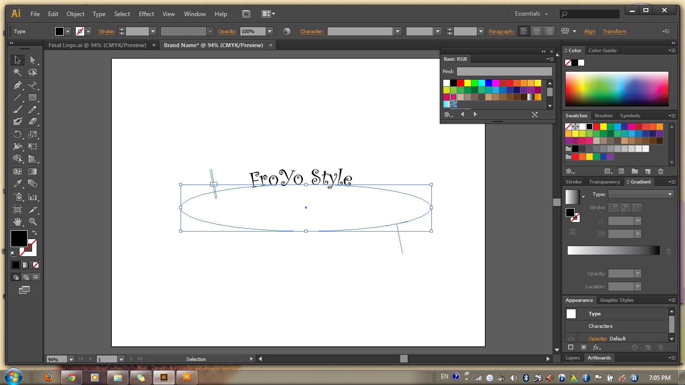
Step 7 (Brand name)
Step 8 (Colour + Tag Line)

Step 9 (Final - Grouping)

FINAL ARTWORK

Subscribe to:
Posts (Atom)